Is your website mobile-friendly?
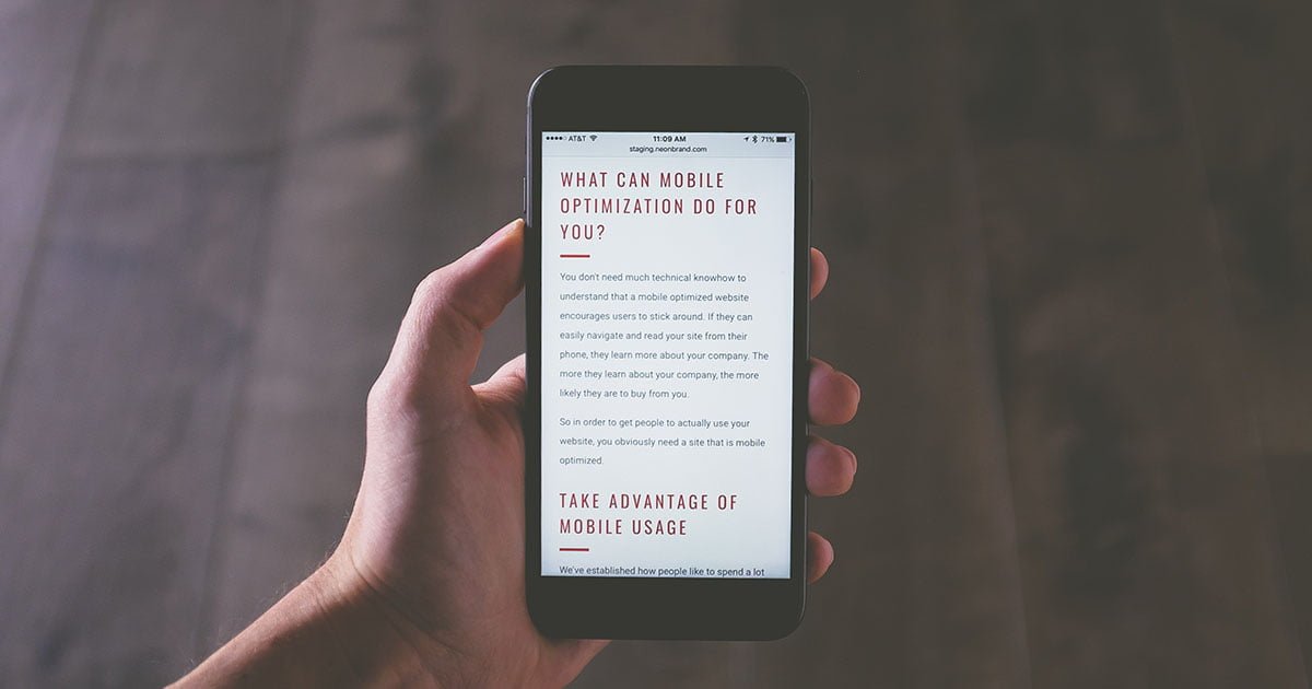
With the increasing number of people using their mobile devices to access the internet, having a mobile-friendly website has never been more important!
Is your website mobile-friendly?
With almost 7 billion mobile users worldwide, you may want to make sure it is!
Mobile web design is an exciting and constantly evolving field that has the power to transform the way businesses and organizations connect with their customers. With the increasing number of people using their mobile devices to access the internet, having a mobile-friendly website has never been more important!
Listening to Google technical writer Rachel Andrew speak at the Web Unleashed conference in October 2022 really brought this home for me. There are almost 7 billion mobile users worldwide* and because of this, I know that mobile web design is a key driver to help our web clients reach a larger audience.
As a user experience (UX) designer, I make it a best practice to design our clients’ websites using mobile-first design. This means making sure that their websites are responsive to different screen sizes without compromising their users’ experience on the site. It’s a whole mix of things to consider when designing! Things like the size and placement of buttons and links and the overall organization and structure of the content ensure that users can easily read the website and find the information they are looking for. I even consider things that may go unnoticed, like optimizing the site for fast loading times, because mobile devices often have slower internet connections than desktop computers have.
Two great benefits of a mobile-first web design:
- We can reach and engage with audiences who are on the go;
- We can create unique and innovative user experiences.
Designing for the smaller screens and touch-based interfaces of mobile devices, UX designers (like me!) can get creative and come up with new ways to make websites engage and interact with their users. This can include things like interactive maps, augmented reality (AR) experiences, and personalized recommendations, to name just a few.
Mobile design is an essential and exciting aspect of modern business and marketing. By leveraging the power of mobile devices and the latest web design technologies, businesses and organizations can reach and engage with their audiences in new and meaningful ways.
So if you want to stay ahead of the curve and connect with your clients/customers on the go, it's time to start thinking about mobile web design! At Innovate By Day, we have a fully in-house web team who are constantly studying, researching, and developing our mobile web design expertise! Visit our website or email nilu@innovatebyday.ca to learn more!
*source: Web Unleashed conference 2022
-----
Nilu Seneviratne is Innovate By Day's UX Designer. She is constantly evolving her design process, adopting new trends and best practices of website user experience including responsive design, accessibility, and user interface design.
Photo by Kenny Eliason on Unsplash
- Share on Linkedin
- Share on Facebook
- Share on Twitter
Share this blog
- Mobile
- Mobile web design
- mobile-friendly
- Rachel Andrew
- Web Unleashed
- Site optimization
- interactive maps
- augmented reality
- UX design
Related Posts

Celebrating Women in Tech: My Journey, Inspirations, and Working in a Women-Led Company
Posted on Tuesday March 26, 2024 by Nilu SeneviratneIs your website mobile-friendly?
Posted on Thursday January 12, 2023 by Nilu Seneviratne